Satellite imagery gives us an invaluable bird’s eye view of how ecosystems have responded to decades of human influence.
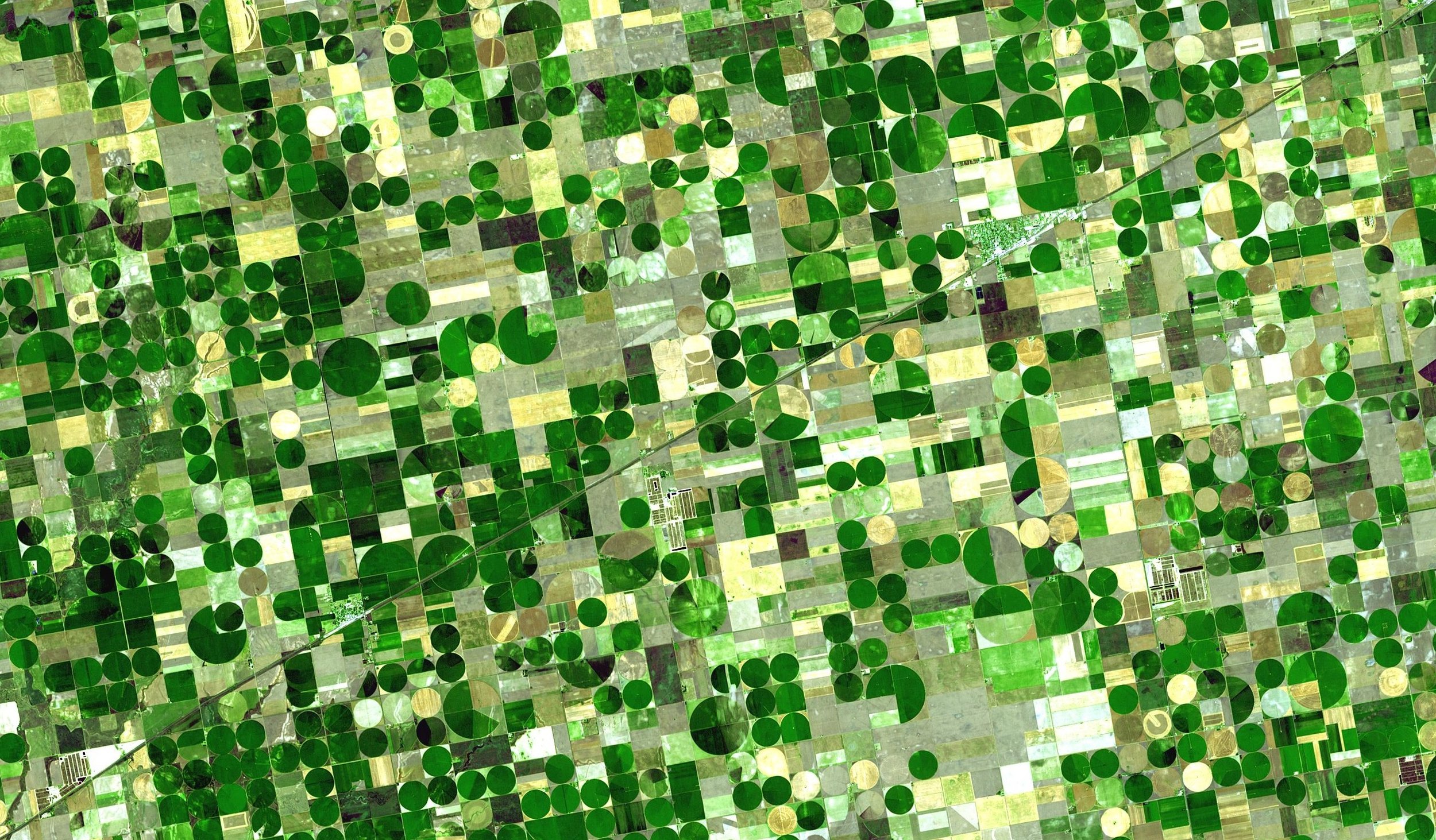
Satellite imagery can help us understand how the environment has changed over time. NASA/Wikimedia Commons (public domain)
Slashing through dense forests, riding heaving waves, scaling steep mountains — early cartographers had a rough time making maps. Creating order from the chaos of nature surely had its rewards, but early maps were ultimately limited by the technology of the time: brushes, parchment, and a compass. If those cartographers had known what was to come — huge floating cameras suspended in the sky that photograph the entire Earth every two weeks — they might have cried in despair: A lifetime’s work of painstaking measurements and drawings could be condensed into a single afternoon!
Yet remote sensors, the people who use satellite imagery to create digital maps, face a host of problems that would have baffled those early cartographers. While they are powerful tools, satellites do not produce immediately usable data with each click of the shutter. Clouds are the scourge of remote sensing, obscuring the land beneath and rendering images useless. Then there is the angle at which a photo is taken, the thickness of the atmosphere, and the presence of air or light pollution to consider. That perfect photo from the sky is harder to capture than it seems.
During his early years as an ecologist, Nicholas Murray was intimately familiar with these problems. He was interested in mapping how ecosystems changed over time, but ran up against the many issues of satellite data. When he started a position at the University of New South Wales funded by the IUCN Red List of Ecosystems, the problems multiplied. The IUCN Red List of Threatened Species is a familiar system to many, categorising all the world’s flora and fauna by their risk of extinction. The Redlist of Ecosystems endeavours to perform the same service, but instead identifying the ecosystems that are most at risk, like Caribbean coral reefs or the coastal rainforests of northeastern Australia. Pinpointing the most threatened ecosystems would allow governments around the world to prioritise their conservation.
Murray’s role with the IUCN was to produce maps for large-scale ecosystem analyses, and he would often partner with governments to produce these maps. But for many countries around the world, he had to start from scratch, building a complete map from raw satellite data. Multiplied by so many countries, his workload became overwhelming. “I thought, there should be an easier way to make maps,” says Murray. “You should be able to be sitting in a national park in Madagascar, wanting to know how the park has changed over time, and be able to make a map of that.”

On the ground, it can be difficult to gauge the extent of habitat change over years or decades. Eric Mathieu/Wikimedia Commons (CC BY-SA 3.0)
Equipped with technical skills and a drive to make ecological map-making more accessible, Murray teamed up with David Keith, a conservation biologist, and Richard Lucas, a remote sensor, to source funding for the project. They received a grant from Google to cover their costs, and it came with a game-changing perk: the computing power of the Google Earth Engine. Murray quickly joined up with two programmers from UNSW and set to work building his dream mapmaking program, known as REMAP.
Murray wanted REMAP to be accessible to anyone, anywhere. This meant he had to overcome three obstacles: cost, geographical scope, and data management. If money were no object, he could have had his pick from a fleet of satellites orbiting and photographing the planet. But fine-scale pictures like the ones on Google Maps, where you can see individual trees or cars or people, are produced by private companies, with sky-high prices to match. Other datasets might be more reasonably priced, but don’t cover the entire globe.
Only one data record matched his criteria: Landsat, a program launched in 1972 by the US government which is now the longest continuous data record of global change on Earth. The dataset is freely available and covers the entire globe, broken up into 30x30-metre pixels. REMAP hosts billions of these pixels, and, unsurprisingly, they take up a fair amount of space — four terabytes, to be precise. “If we didn’t have Google’s infrastructure to run [REMAP], it wouldn’t have been possible,” says Murray. By hosting the data and running the program on Google Earth Engine, REMAP is accessible for individuals or governments with limited computing or storage capacity.
With a powerful processor, heaps of data storage, and a worldwide dataset, Murray and his colleagues had only one step left: to perfect the satellite images. Over the course of three years, the scientists pored over image after image, making sure they were pristine and ready to use. Finally, they launched REMAP in December 2017.
The beauty of the program lies in its simplicity. The hard work behind the scenes, the terabytes of data, the processors humming away — all of this is hidden from the user. Instead, they see a global map of perfect images, which they can use to classify ecosystem types in their study site of choice. This is not like a normal map; each pixel of the map has a hidden layer of “predictors”, information about that patch of land, such as its colour, elevation, slope, and precipitation. Then a user highlights their study site and feeds REMAP a “training set”, telling the program that one pixel is desert, one pixel is forest. Once the training is complete, Google’s machine learning takes over, using the underlying predictors and the user’s training set to create an ecosystem map of the entire area.
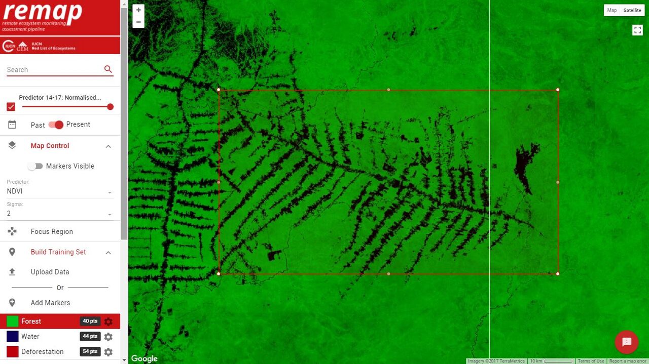
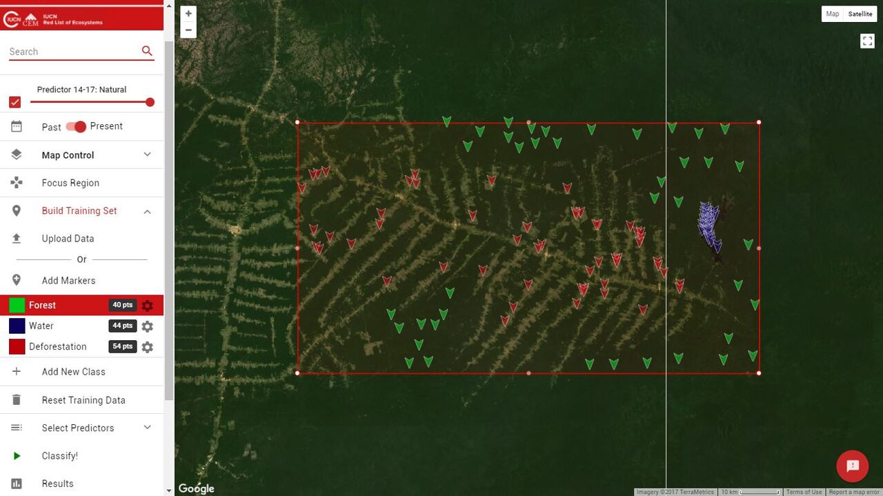
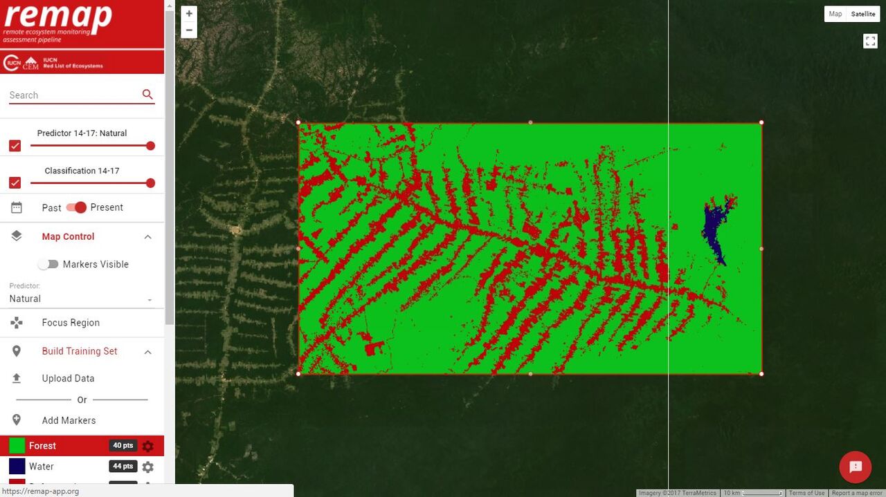
Right now, these areas are limited to 100,000 square kilometres, about the size of Iceland. But Murray is working with Google to expand through space and time. REMAP currently allows users to produce maps from the years 2000 and 2017 to show how ecosystems have changed over 17 years, but Murray wants more. “What is in development right now is that you can type in a date, and REMAP will build an image mosaic for that date,” says Murray. Ultimately, REMAP may become one of the most user-friendly ecosystem-mapping programs on the market.
Since its soft launch in December 2017, over 5000 people from 138 countries have used the program. Murray initially thought the bulk of his users would be in government-funded positions, like national park rangers who were interested in how their parks were changing but lacked the training to make their own ecosystem maps. But Murray has seen a range of users employ REMAP, from ecology students making quick maps of their study sites, all the way to highly-trained remote sensors working for government monitoring programs.
In the end, while REMAP has been a useful tool for thousands of users, Murray believes it is the environment that will reap the greatest benefits moving forward. The program was created to help his work with the IUCN Red List of Ecosystems, and, already, governments from Myanmar to Colombia have used REMAP to support efforts to identify their most threatened ecosystems. Once those ecosystems are pinpointed, the next step is conservation, so that fewer natural ecosystems vanish from under the floating cameras in the sky.
Edited by Andrew Katsis


