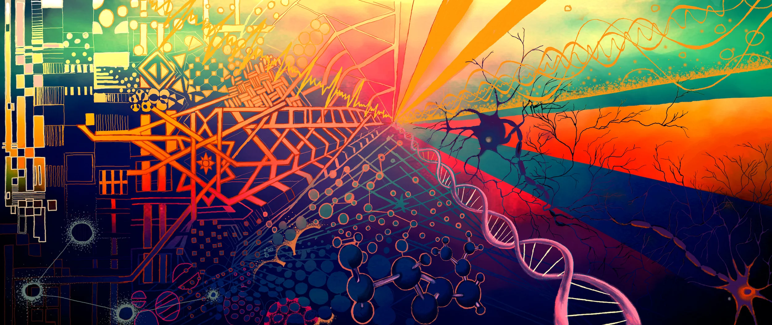
Collaborations between science and the arts have a long history. Today, visual artists are crunching big data and musicians are contemplating DNA and climate change.
Illustration by Corrina McAtee
Science and art
By Chloe Warren
It’s true, we’ve come a long way since punch cards and floppy discs. But scientists have been struggling with the challenges that come with data storage, analysis and transport long before ‘big data’ became a buzzword. Since the dawn of the digital age, more industries are generating more data. Big data has become a part of everyday life, whether we are aware of it or not. Data handling skills are taking a more central role in the modern curriculum, and innovative ‘teach-kids-to-code’ education initiatives seem to be in constant development.
Artists are increasingly looking towards these data for inspiration. The fact that data is often freely available lends it neatly towards artistic interpretation and interrogation. Designer and statistics enthusiast, Karin von Ompteda uses some of these open access databases within her ‘Data Manifestation’ workshops. The workshops originated at the Royal College of Art (RCA) in London in 2010, but she has since adapted them for other universities, institutions, and even the general public. The groups investigate data sources in order to find an interesting story to tell – then work together to find a way to tell it. Vitally, the participating students are recruited from across the college programmes: architects work alongside ceramicists and designers with animators.
Two women discussing their work while entering data onto punched cards at Texas A&M in the 1950s. Cushing Memorial Library and Archives/Wikipedia Commons (CC BY 2.0)
“The students have to really work to make the connections,” said von Ompteda. “But it’s a bit like professional creative dating – they can end up making lifelong friends and collaborators from other disciplines.” These cross-disciplinary classes were an initiative of Head of the RCA Academic Development Office, Chris Mitchell. However, before von Ompteda began teaching her workshops, data visualisation wasn’t yet part of the curriculum. She seized her opportunity – though she now prefers the term data ‘manifestation’: “Students communicate information through projects that are not only visual, but physical and experiential”.
In Jessica Morgan, Marcel Helmer and Paul Stawenow’s Balance, the students (from the Visual Communication, Design Interactions and Innovation Design Engineering programmes, respectively), examined the World Values Survey during one of von Ompteda’s workshops. They sought to investigate the differences between what people want and what they are willing to pay for.
The project visualised the percentage of people who agreed with the following statements: “The Government should reduce environmental pollution, but it should not cost me any money” and “I would agree to an increase in taxes if the extra money were used to prevent environmental pollution”. These percentages were translated into wooden objects – one representing each of 22 countries – communicating the ‘balance’ (or lack thereof) between these two perspectives. Thus the objects tilted toward the ‘safety’ of the wall, or dangerously close to the edge of the platform. “In the world of design, the communication of data has become an established creative practice,” said von Ompteda. “In the project Balance, we can see the mathematical foundation of the work through its graph-like forms, yet it also offers a metaphor for the precariousness of our future.”
Like von Ompteda, artist and academic Robert B. Lisek is no stranger to data. As well as using large scale data sets in many of his artworks, Lisek researches many of the concepts which are central to the methods used analyse the data itself. These include combinatorics, complexity theory, logic and algebra. One of the central themes seen is his works is public security: in Crash 2.0, Lisek focuses on the Smolensk air crash of 2010. The crash, which killed 96 individuals including the President of Poland and a number of other high ranking officials, was declared a result of ‘pilot error’ in a 2011 Polish government report. However, a number of conspiracy theories still circulate. In this era of big data, public and political responses to such large scale incidents can actually be monitored. Through a series of installations, including a 'web worm' that live-tracks the internet to track potential security threats, Lisek investigates the impact of these responses, which include changes to national security and privacy policies as well as shifts in power relations between countries.
Jessica Morgan, Marcel Helmer and Paul Staweno, Balance (2015), MDF shapes. Dominic Tschudin/Royal College of Art Archive (reproduced with permission)
Artists then, are a compelling force in the dissemination of big data. Through workshops, analysis, and interpretation, artists have the power to connect us to big ideas. By focusing on big data, art enables us to visualise data sets that are too large and complex for traditional data processing applications. In turn, this presentation provides new meanings, greater understanding, and extends the reach of science to those who may not always identify with it's perceived lack of passion.
Of course, art is not the only way to interpret scientific information. Music too, has a rich history of its own with science.
Science and music
By Jack Scanlan
Music is widely considered one of the most emotional forms of human artistic expression. Science, on the other hand, has a reputation for being clinical and serious, cut off from passion. A relationship between the two may seem at least a touch ironic; why would we attempt to bridge the gap between them? But there is always complementarity between fields of human experience. You just need to know where to look.
The first way one might see science and music interacting is in the field of neuroscience, in which some researchers specialise in discovering the biological causes of humanity’s near-ubiquitous obsession with musical sounds and noises. Finding out where appreciation for music lies in the brain and how art can arise seemingly spontaneously from the minds of creative individuals is obviously a noble endeavour, with important implications for the way we understand ourselves and our brains. But this is a one-way relationship between science and music, one peering inside the other. Music doesn’t seem to get anything out of the arrangement, not really.
There’s only one sense in which science and music can truly collaborate, and that’s music using science as inspiration. Here the relationship is more two-sided — music takes from science, but also gives back, instilling scientific discoveries and ideas with a wider sense of cultural relevance. Science suffers from a kind of invisibility in our society, wherein people continuously use its technological and medical fruits without realising their origin, and this is something music can help resolve.
The official music video for Mutual Core, by Björk, from her 2011 album Biophilia.
The collaboration of science and music should then be a powerful force. But while the neuroscience of music takes gradual, steady steps into new frontiers of knowledge, the musical expression of science has a far more uncertain gait. Art is tricky and people’s response to it even more so; what resonates with one person may fail to move another. Integrating science into music requires skills that comparatively few possess, and audiences can sometimes feel science is being forced down their throats.
But when it comes down to it, music is an artform, and science is simply another foundation upon which such art can be based; if the art is good, people will listen. There is nothing particularly problematic about blending science and music either, other than what our culture perceives as incongruity. In reality, science is rarely passionless: in fact, most scientists would argue that passion sustains scientific endeavour, and without passion, very little would be known. But such passion is internal to scientists, and usually inaccessible to a wider audience. Thankfully, music excels at expressing these feelings.
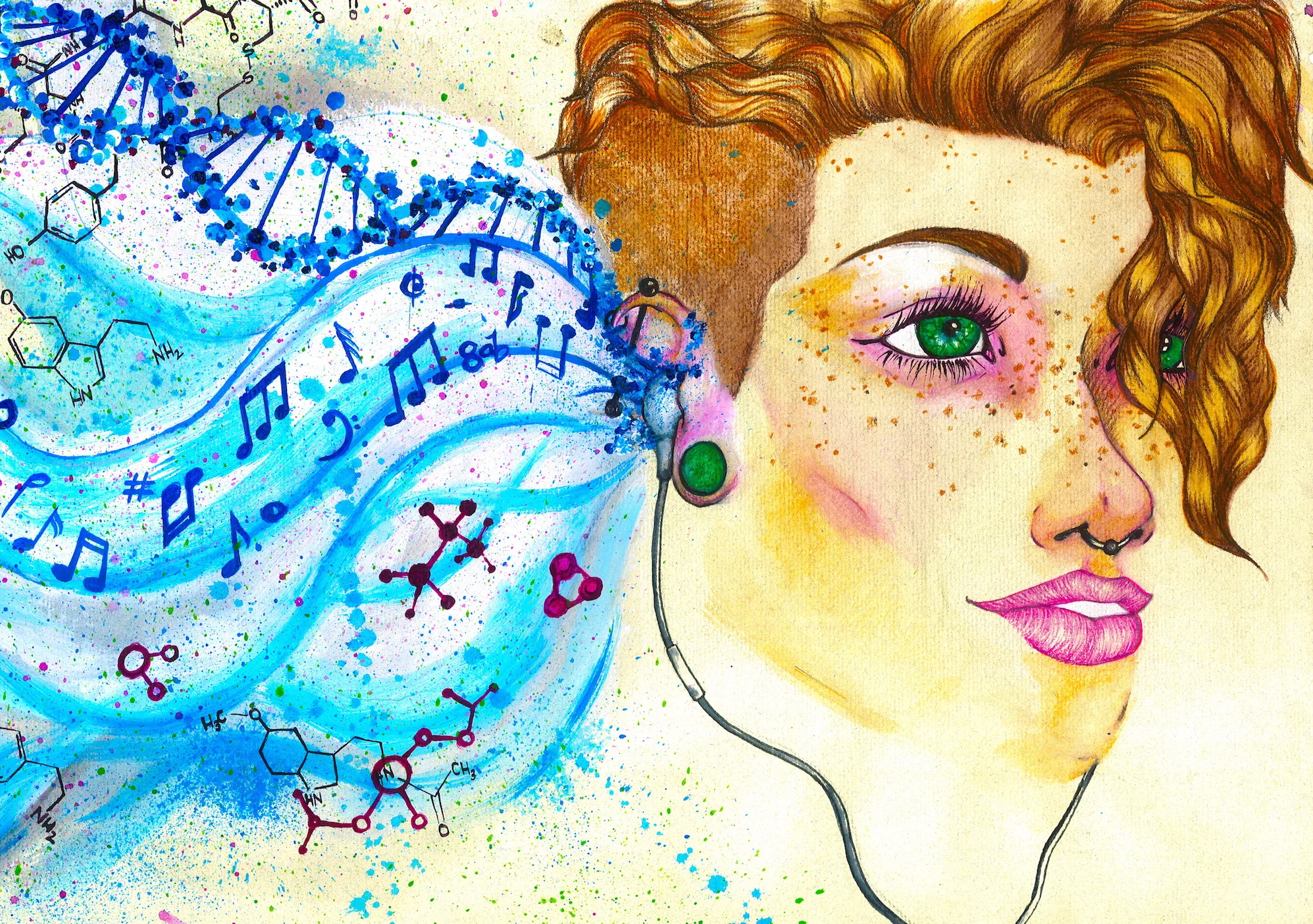
Fantastic examples of the successful blending of science and music can be found in the work of Icelandic avant-garde pop artist Björk. Her 2011 album Biophilia exposed her millions of fans to music exploring humanity’s place within a scientific universe, with songs like Mutual Core (about plate tectonics), Hollow (about DNA and heredity) and Cosmogony (about the origin of the universe) filtering explicitly scientific concepts through the prism of human experience. The album’s composition was also inspired by science, with Tesla coils and custom instruments providing the backdrop for Björk’s achingly sincere vocals.
The official music video for Crystalline, by Björk, from her 2011 album Biophila.
Biophilia uses metaphor as a powerful technique for highlighting the emotion in science and the natural processes it discovers. In Mutual Core, the volatility of Earth’s interior becomes a statement about the heat of human relationships, with the core of the planet representing the stability of a union between two people, even as the surface is tumultuous. The music matches this idea, explosively erupting in moments of drama, mimicking volcanic activity. Crystalline, the first single from the album, likewise compares the branching, crystal growth of minerals and rocks to how relationships form between networks of people. Through these songs, people can see themselves reflected in nature.
Björk’s work is, admittedly, an extreme case of scientific inspiration in music, as Biophilia was conceived as a concept album that would highlight science and make it accessible. More subtle examples of collaboration between music and science can be found in a large proportion of the work of folk rock singer-songwriter Andrew Bird, whose violin-heavy compositions juxtapose counterpoint-inspired melodies with wordy lyrics and inventive narratives.
While Björk takes an unabashedly positive view of science, Bird’s take is more mixed, with the science even more deeply obscured in layers of metaphor. For him, science usually serves as nothing more than a jumping-off point for a narrative journey, or part of a greater lyrical whole. Bird often uses scientific imagery to express the realities of a cynical world and to add colour to the stories he tells.
The official music video for Imitosis, by Andrew Bird, from his 2007 album Armchair Apocrypha.
Oh No, from his 2009 album Noble Beast, builds a song around a reference to “calcium mines,” which are “buried deep in your chest,” a possible reference to the calcium your cardiac muscle needs in order to contract, or the calcium in the bones of our bodies; this forms a metaphor for hiding ourselves away and obscuring our true feelings. Darkmatter, from 2007’s Armchair Apocrypha, references anatomy, DNA and medical physics to explore what makes a person who they are. Imitosis, from the same album, lays out a bleak narrative in which a scientist finds out that nature is cruel and indifferent: “What was mistaken for closeness / was just a case of mitosis”. But these songs, and many others like them, leave the interpretation open to the listener.
Even music without lyrics can take inspiration from science, although the connection must usually be spelled out to the audience ahead of time to make the connection clear. Often this produces a sense in which the music is conveying information about science, information that may be easier to get across to an audience with music than with visual or written communication.
Earlier this year, Daniel Crawford, a student at the University of Minnesota, composed a piece for string quartet that depicts the effects of climate change in different latitudinal bands in the Northern Hemisphere over the last 135 years. Pitch links to temperature, so that higher notes represent warmer years. Over the course of a performance, the piece slowly sweeps up into the higher ranges of each instrument, particularly the highest violin, which represents the Arctic.
A performance of "Planetary Bands, Warming World", composed by Daniel Crawford.
Compositions like this, which link scientific data with musical expression, are undoubtedly useful communication tools, but they can seem to lack a pleasant musicality that draws people to listen to music in the first place. Who would sit down to listen to Crawford’s composition outside of the context of it being an expression of climate data? Perhaps not many. When notes are being informed explicitly by data, humanity can seem absent from a piece of music. But perhaps this is more an issue with society’s expectation of music, than a universal truth about the validity of certain origins over others.
Not all music will, or can be, inspired by science, but we as a society should embrace that which is. Composed and performed with talent, it can inform, surprise and, ideally, delight in equal measure.


